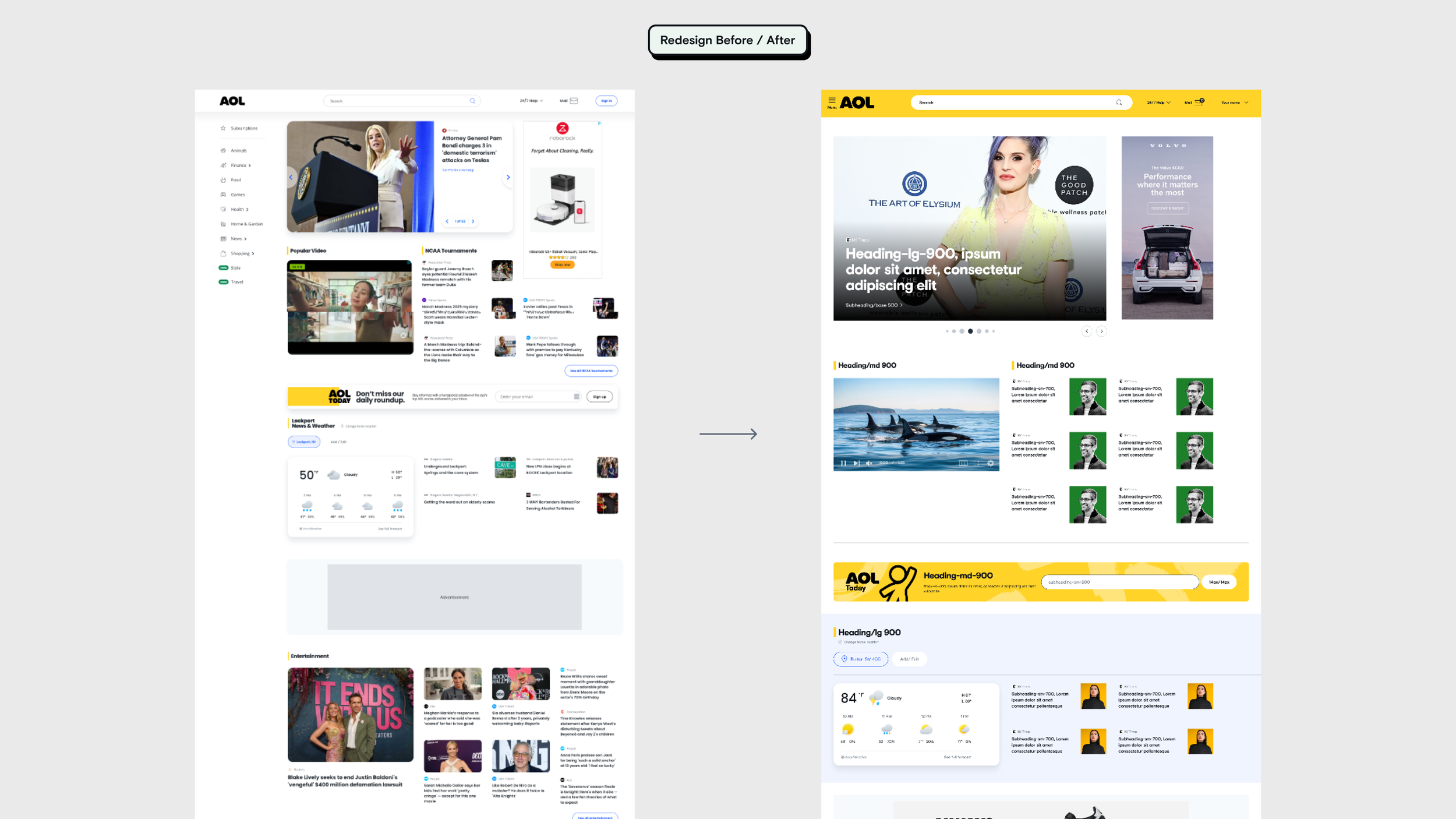
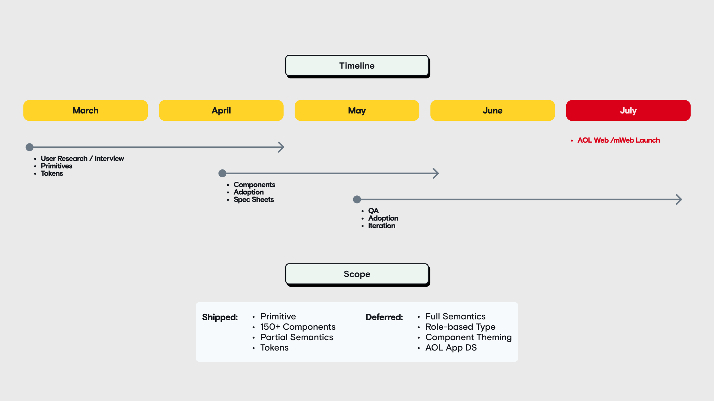
Holding the line — The trade wasn't popular. Reducing visual freedom means designers lose decisions they're used to making, and several pushed back. I held it, because the bottleneck was never design quality — it was that every handoff started as a fresh negotiation, and no amount of craft fixes that. What got deferred was as deliberate as what shipped. A full semantic layer, role-anchored typography, and component-level theming all came after the launch date, not before it. A system nobody can use in July is worth less than a partial system everybody uses in July.
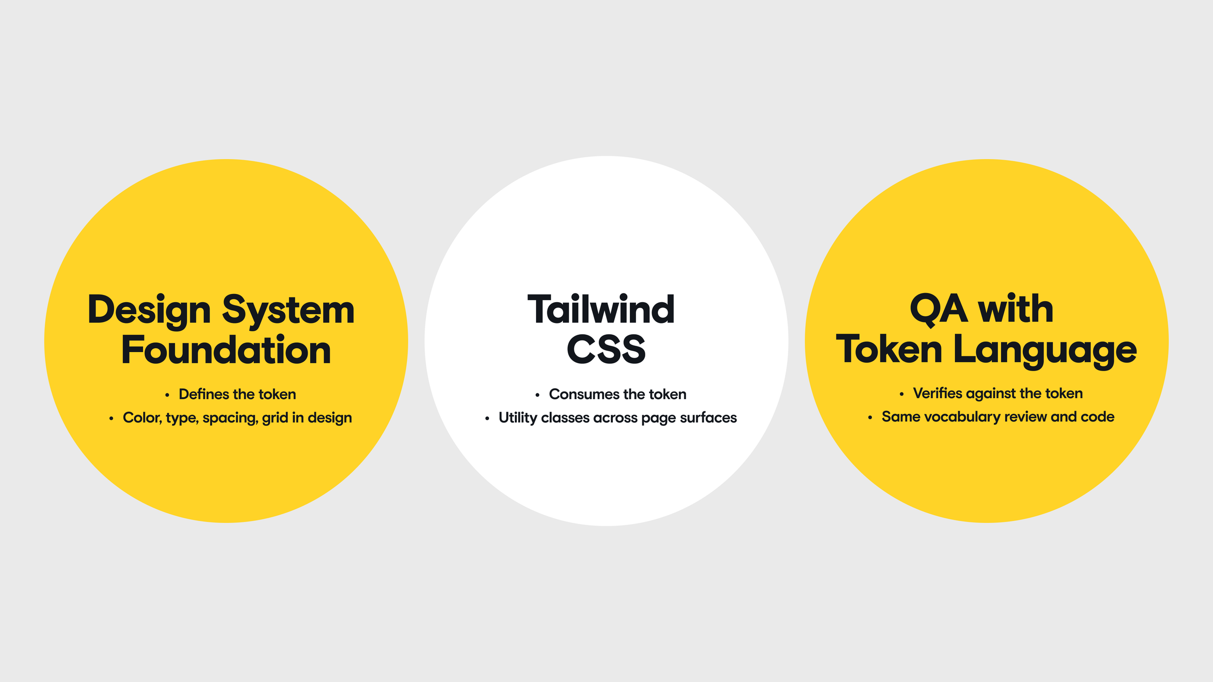
The pipeline, and the contract behind it — Three stages, one vocabulary: the Figma library defines the token, Tailwind consumes it, QA checks against it. There was no Storybook and no automated validation — four months didn't allow for standing one up. What held it together was proximity and shared language. I worked one-on-one with 8–10 engineers, close to sitting at the same desk, from documentation they could build directly from.
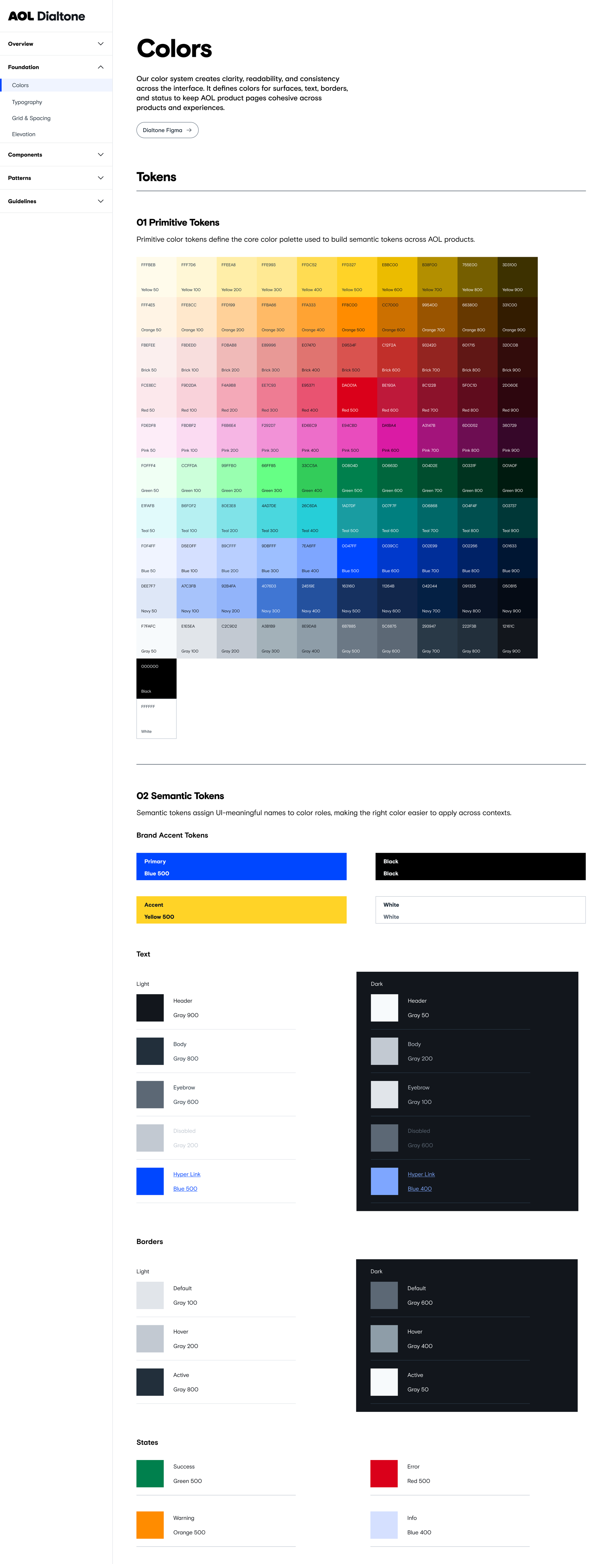
Foundation Setup
Primitive token layer — color, type, spacing, grid — defined first and applied across 150+ reusable modules, with partial semantic coverage layered on where the launch required it.

Documentation, down to the character limit — Each component with variants, usage rules, do/don't in real UI, and a Q&A for the questions designers actually ask. Character limits included, because a 20-character button label is a production constraint, not a style preference.
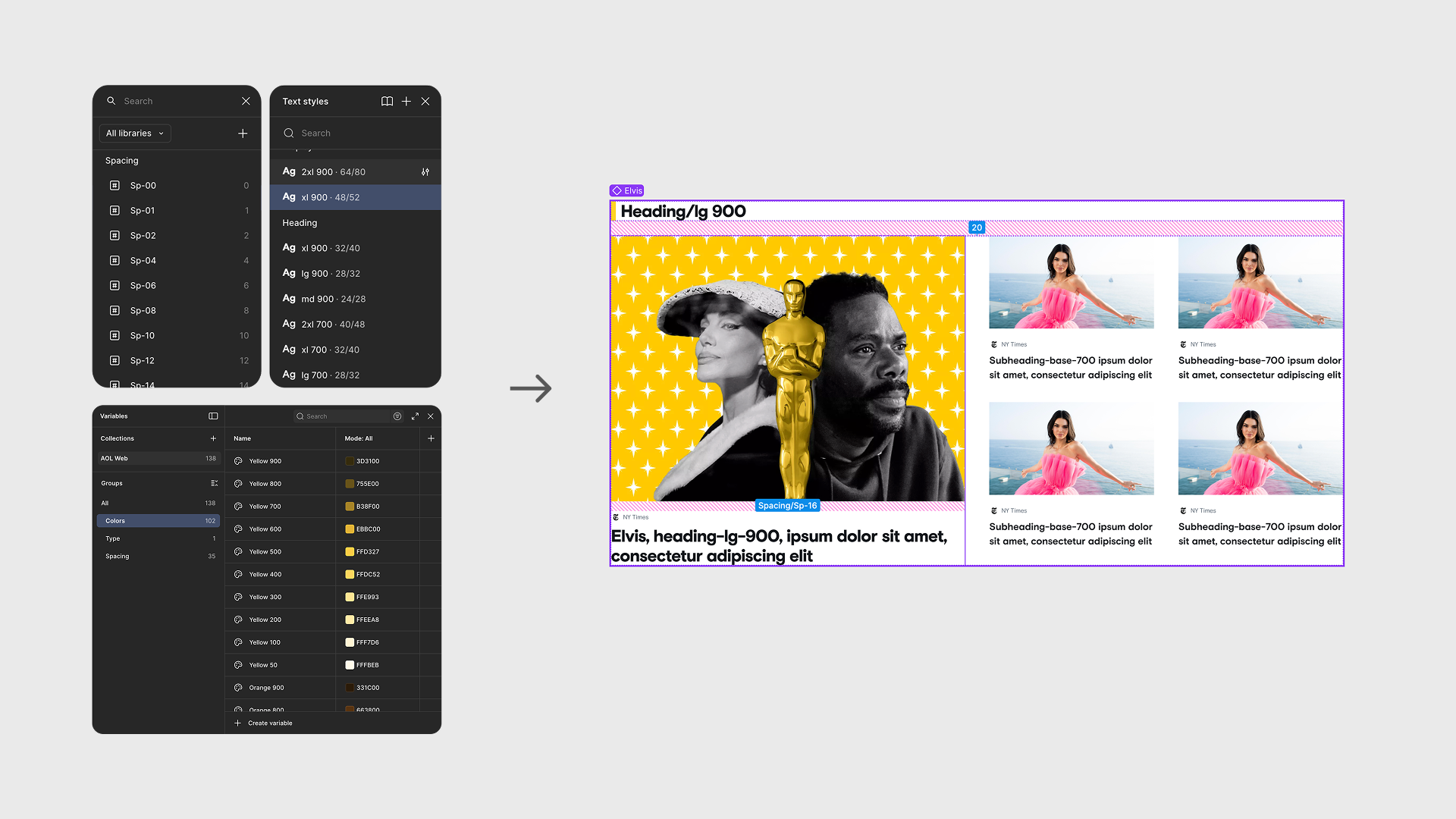
From tokens to interfaces
130+ variables, one library. Spacing, type, and color as published variables designers pulled from directly. The step that mattered wasn't creating them — it was that within a few cycles designers and engineers were describing the same element with the same name.
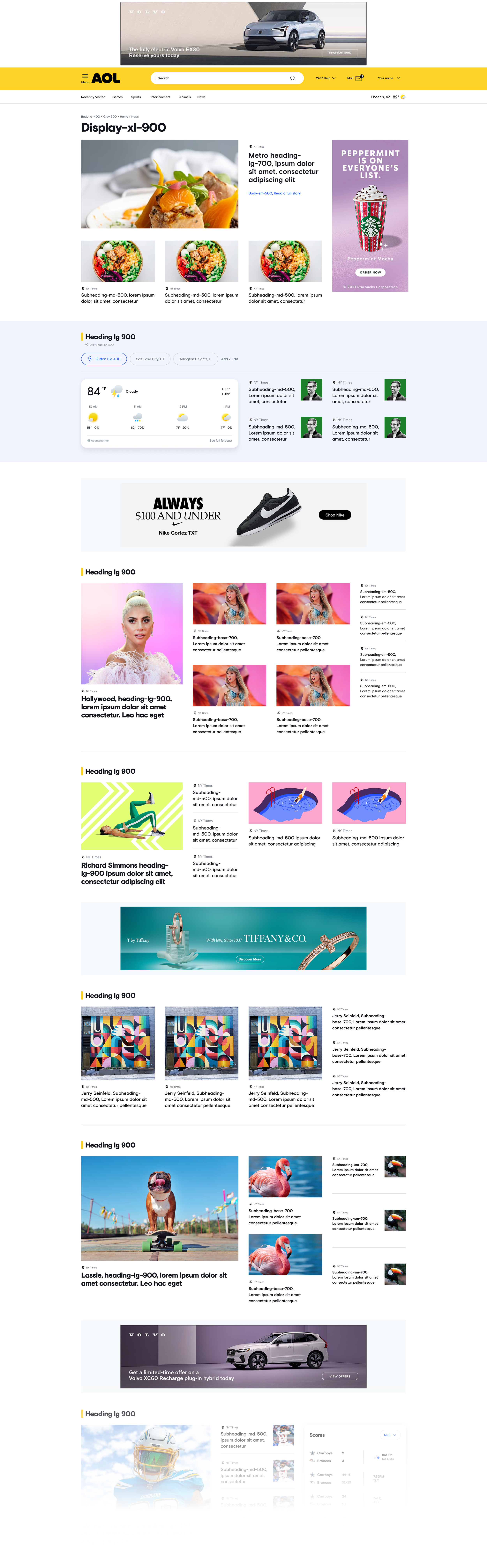
Ingestion-ready design handoff template
Every element named. Designers built handoff files engineering could read tokens from directly, instead of interpreting a spec each time. This is where the week became two days.
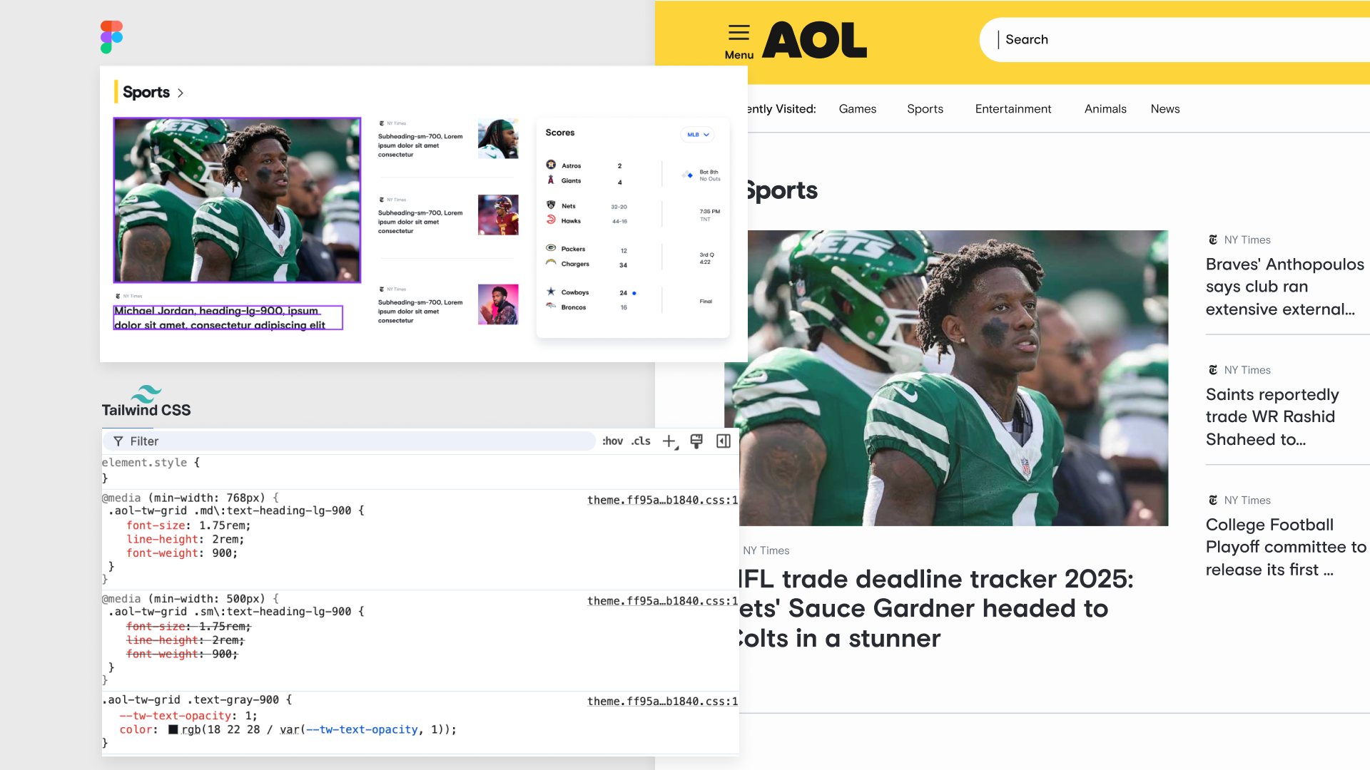
Design-to-code parity
One-on-one pairing with 8–10 engineers through build and QA, holding component parity from Figma to production without a component library tool in place.
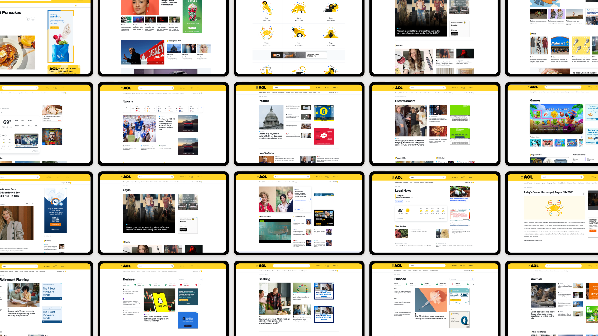
What the coverage looks like
News, Sports, Politics, Games, Finance, Local — verticals with different content shapes, built from the same 150+ modules. The type layer shipped as a size scale rather than semantic roles, and color stayed coupled to the type tokens; both were concessions to the timeline. The v2 sequence was to decouple color, anchor the scale to roles, and extend the primitives into a full semantic layer — the structure I'd built at Carta.
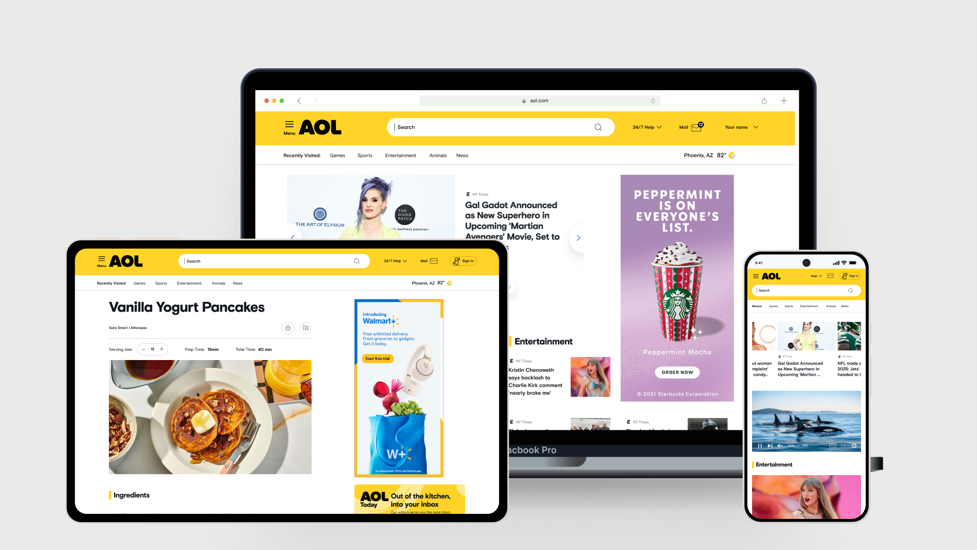
Adoption at launch
Component delivery went from over a week to two or three days; simple components landed in one or two. Over 80% of launch surfaces shipped on the system, and the site launched on time.
The trade I'd re-run — the type layer
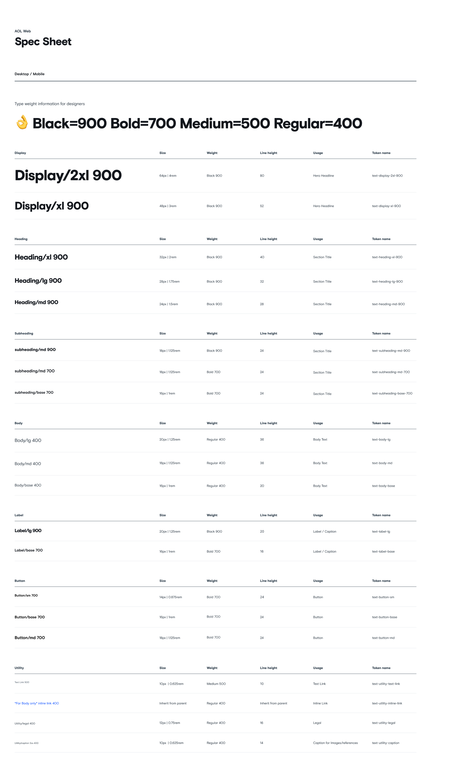
I shipped type as a size scale, not a semantic one. [text-heading-lg-900] names the size and the weight, so designers could pull a style and hand it to engineering without a translation step. In a four-month build with no component library tool, that speed was worth buying.
The cost showed up later. Because the size is in the name, changing what a section title looks like means renaming every instance rather than changing one value — and the scale can't explain itself, so the line heights ended up carrying no visible logic. Color compounded it: it stayed coupled to the type tokens, which is the part that actually blocks theming.
I'd built the alternative before, at Carta — primitives, brand foundation, core semantics, product semantics, where swapping one layer re-resolves everything downstream. I knew what the right structure was. What I'd do differently isn't picking a different structure; it's spending two of those sixteen weeks on the semantic layer for type and color specifically, and letting something else slip. The pieces I deferred instead — component theming, the app system — were additive. This one is foundational, and foundations get more expensive to change every week the system is in use.