
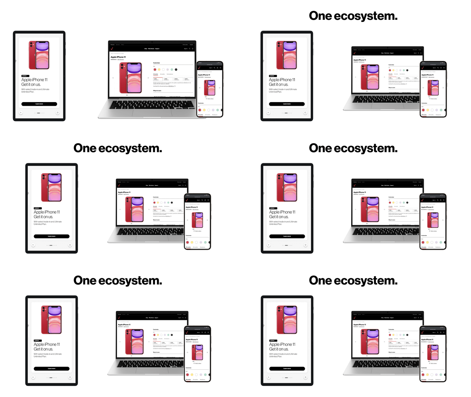
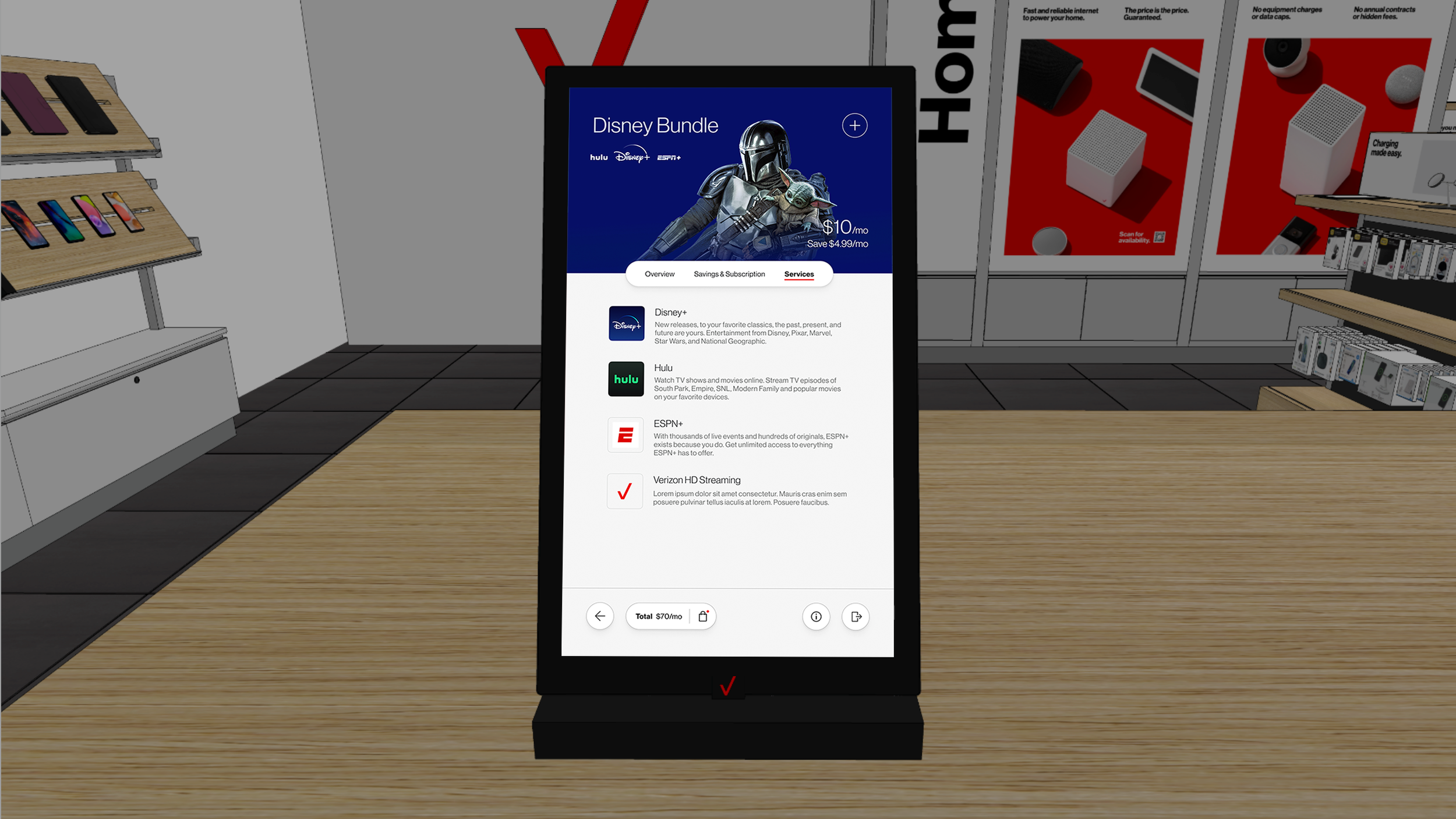
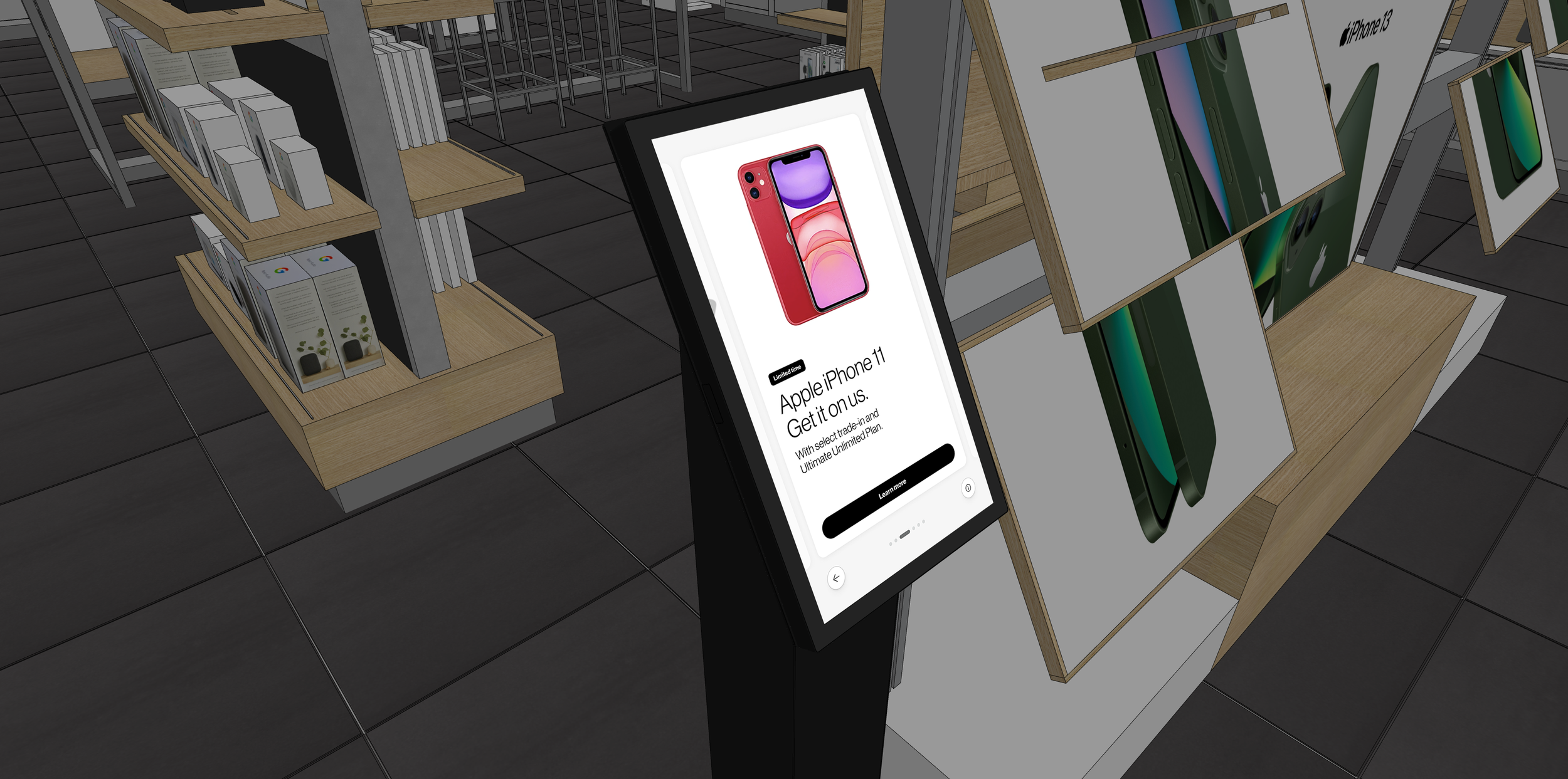
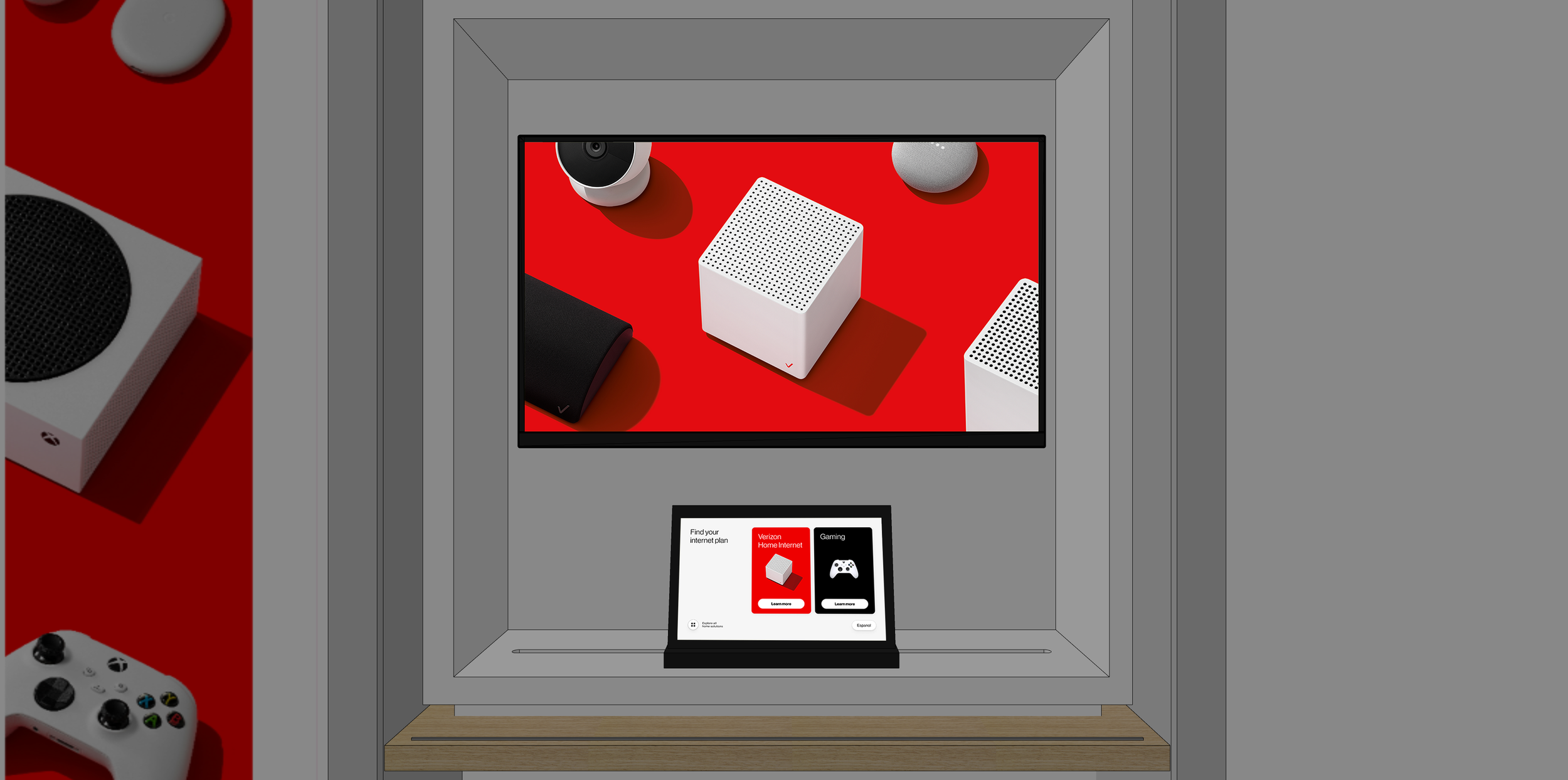
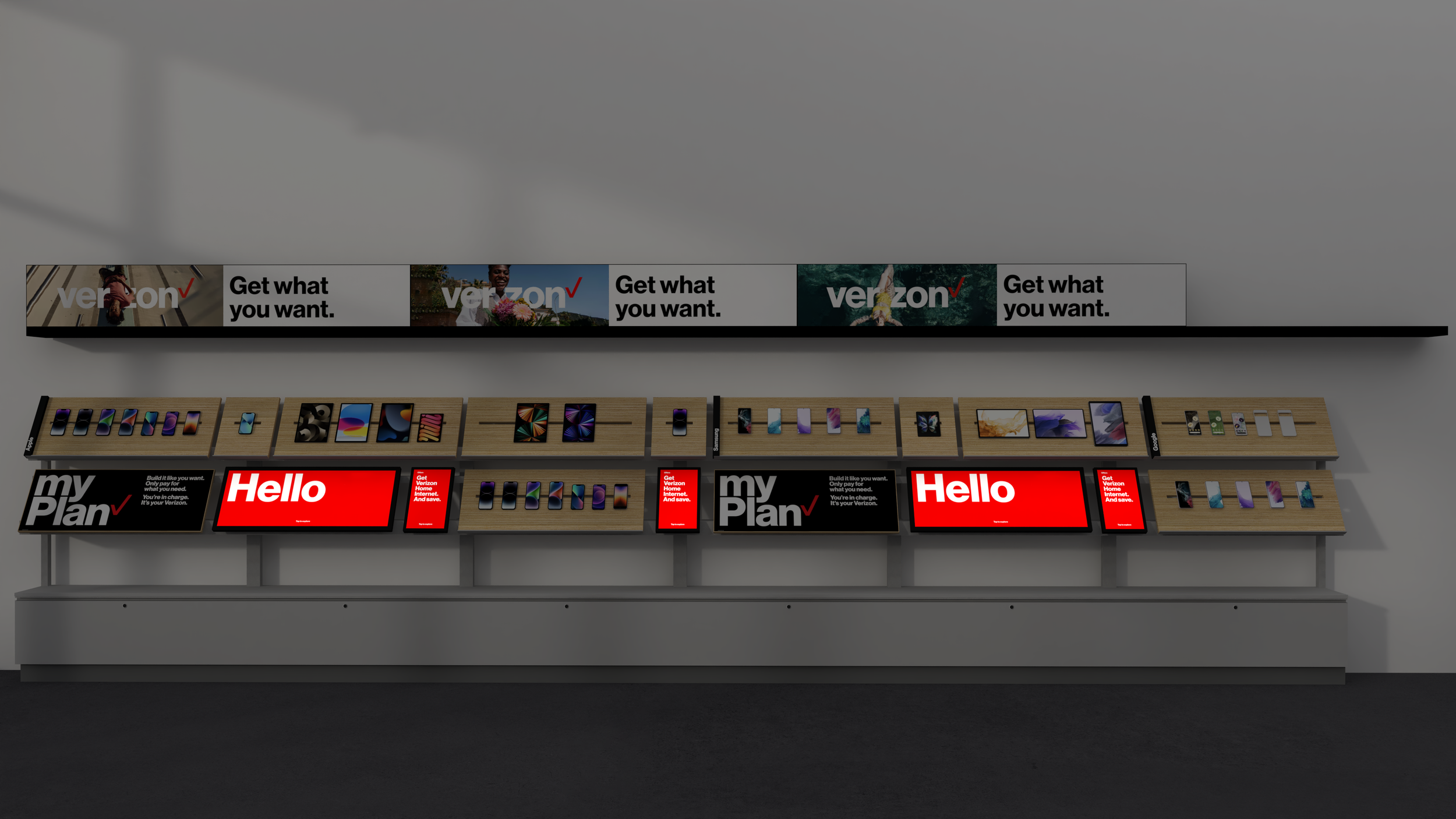
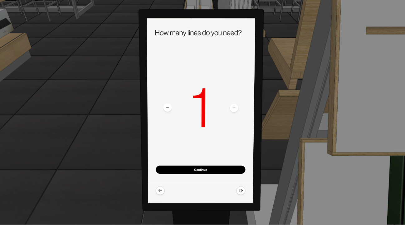


Verizon Retail had successful digital experiences and no shared toolkit to build them with. Kiosks, endcaps, tablets, and display walls were each designed against the Verizon Design System, but VDS was built for web — one viewport, one interaction model, a user sitting still. Retail is six hardware configurations from a 10-inch handheld to a 39.4-inch wall panel, under store lighting, with a customer standing next to a rep.
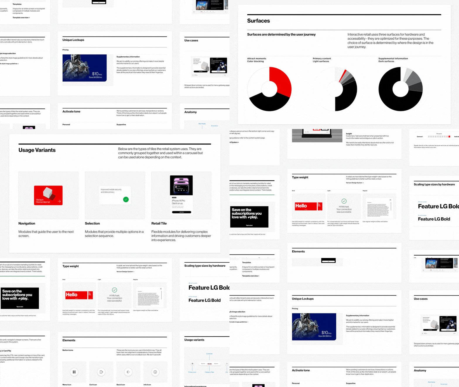
I created Verizon's first Retail Experience Design System: not a fork of VDS, but a retail layer governed on top of it.
Finding the actual problem
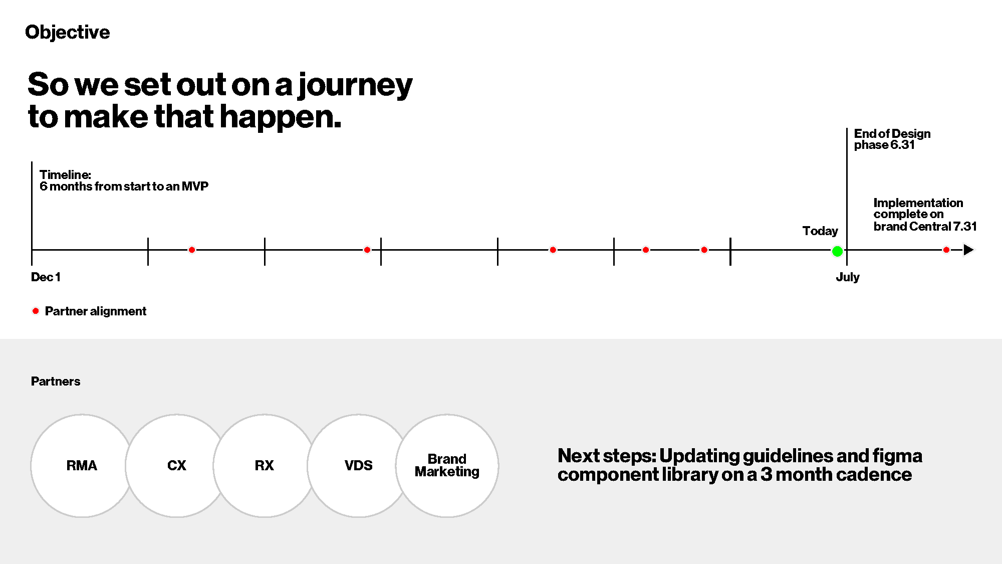
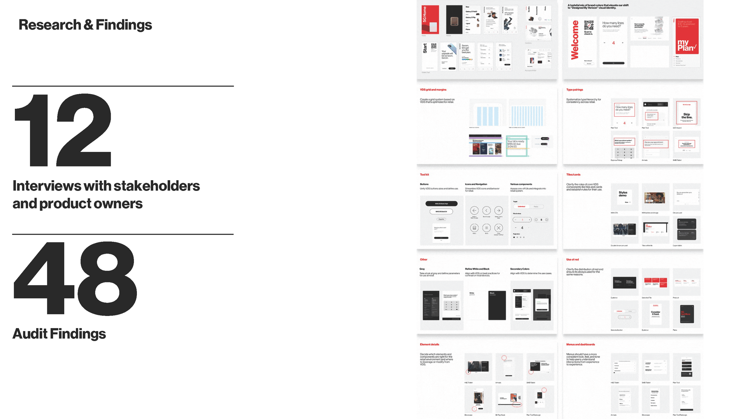
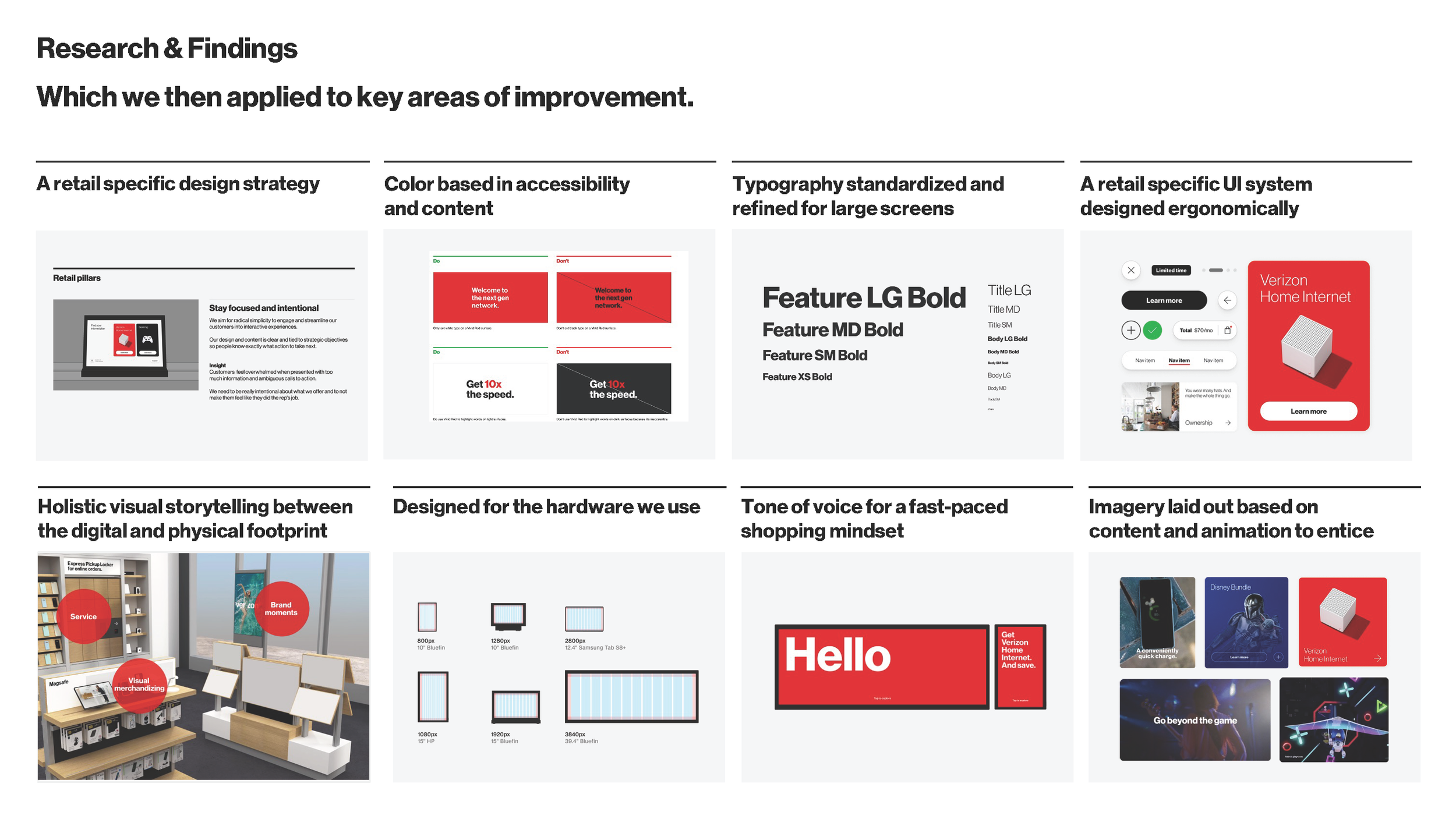
I ran 12 interviews with stakeholders and product owners across five partner organizations — RMA, CX, RX, VDS, and Brand Marketing — and audited the existing retail surfaces. That produced 48 findings, which resolved into eight areas: retail design strategy, accessibility-driven color, typography for large-format screens, an ergonomic UI system, digital-to-physical storytelling, hardware-specific specifications, retail tone of voice, and imagery.
The finding that shaped the architecture: teams weren't diverging because they disagreed. They diverged because VDS had no answer for a 39-inch screen, so each team invented one.
Sizing as a system dimension
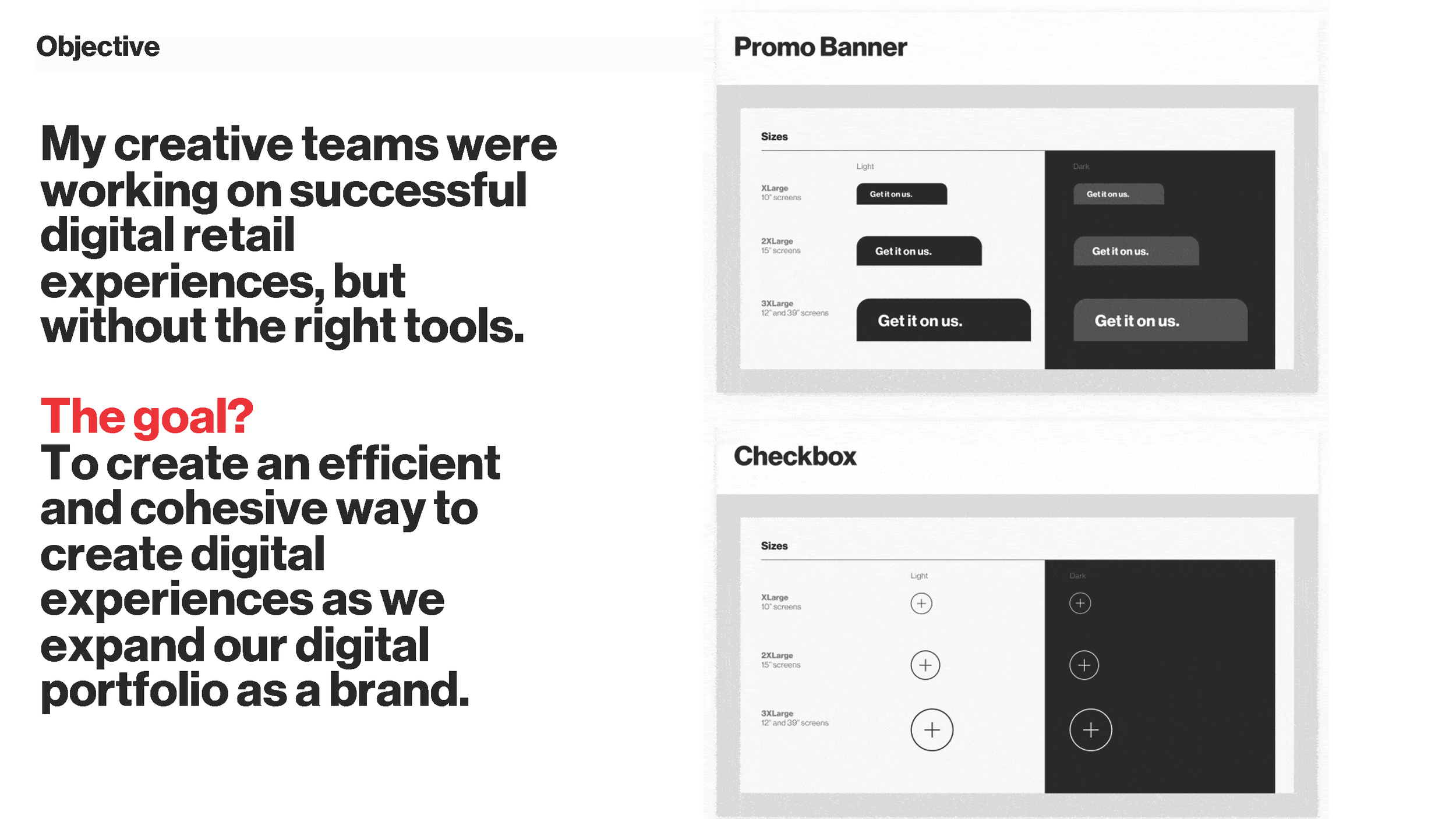
Every component carries three size tiers mapped to hardware rather than breakpoints — XLarge for 10-inch screens, 2XLarge for 15-inch, 3XLarge for 12-inch and 39-inch panels — each with light and dark variants. A promo banner or checkbox resolves its own scale from the screen it lands on. Designers select the surface; the system resolves the value.
Typography was rebuilt on the same principle. A Feature/Title/Body scale in defined weights, tuned for viewing distances VDS never accounted for. Color was re-specified against store lighting: rules for red on white versus red on dark, because contrast that passes on a monitor fails on a backlit panel across a room.
The tradeoff
Retail teams gave up local styling freedom. In exchange, core system changes propagate instead of requiring a re-skin, and a component behaves the same on a handheld tablet and a wall display without being redrawn.
Applying it: the SMB brand refresh
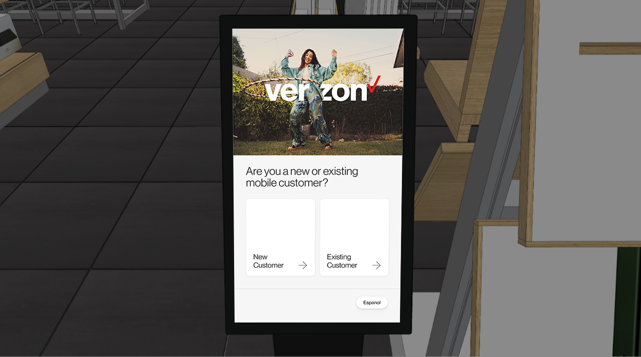
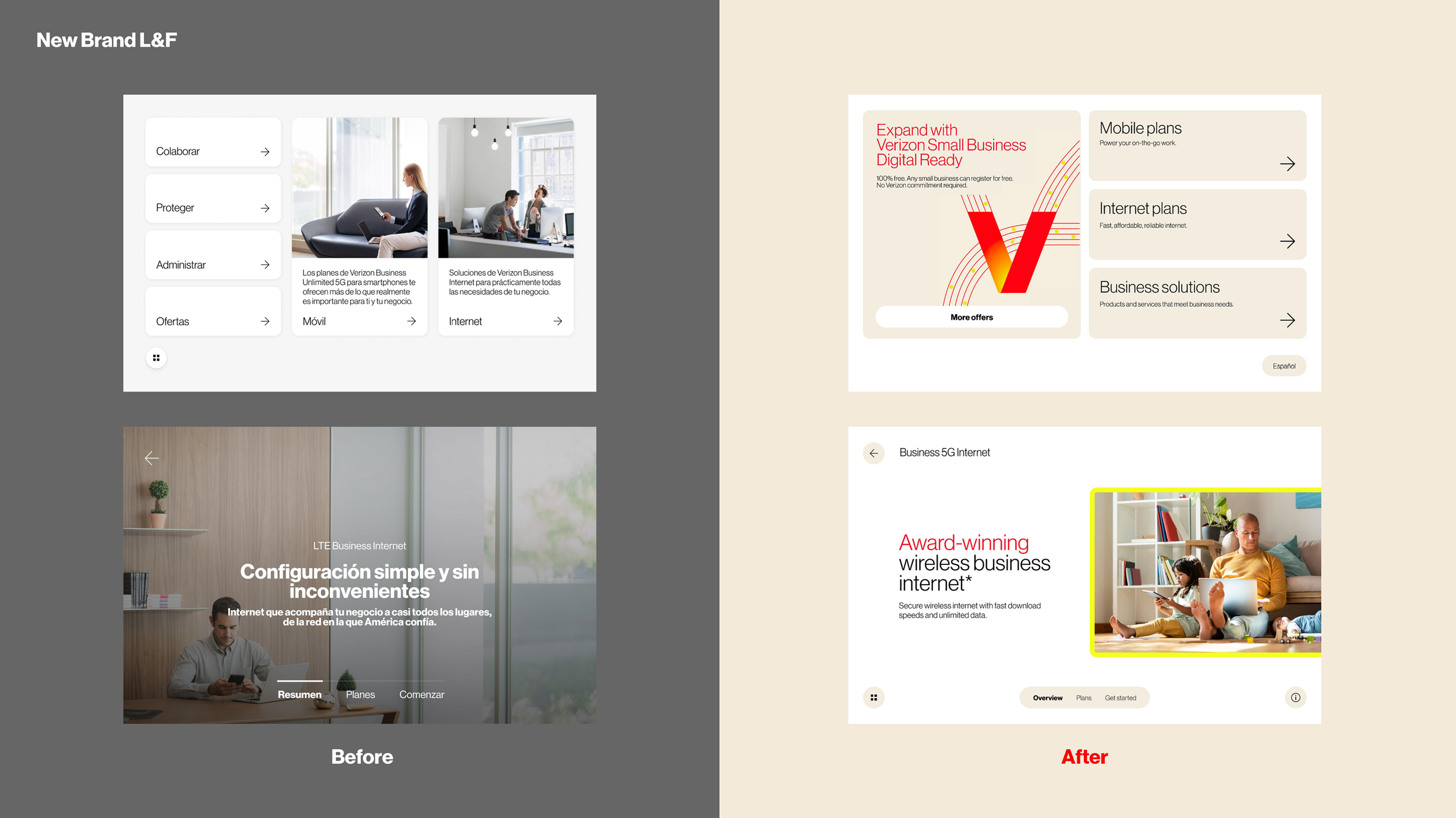
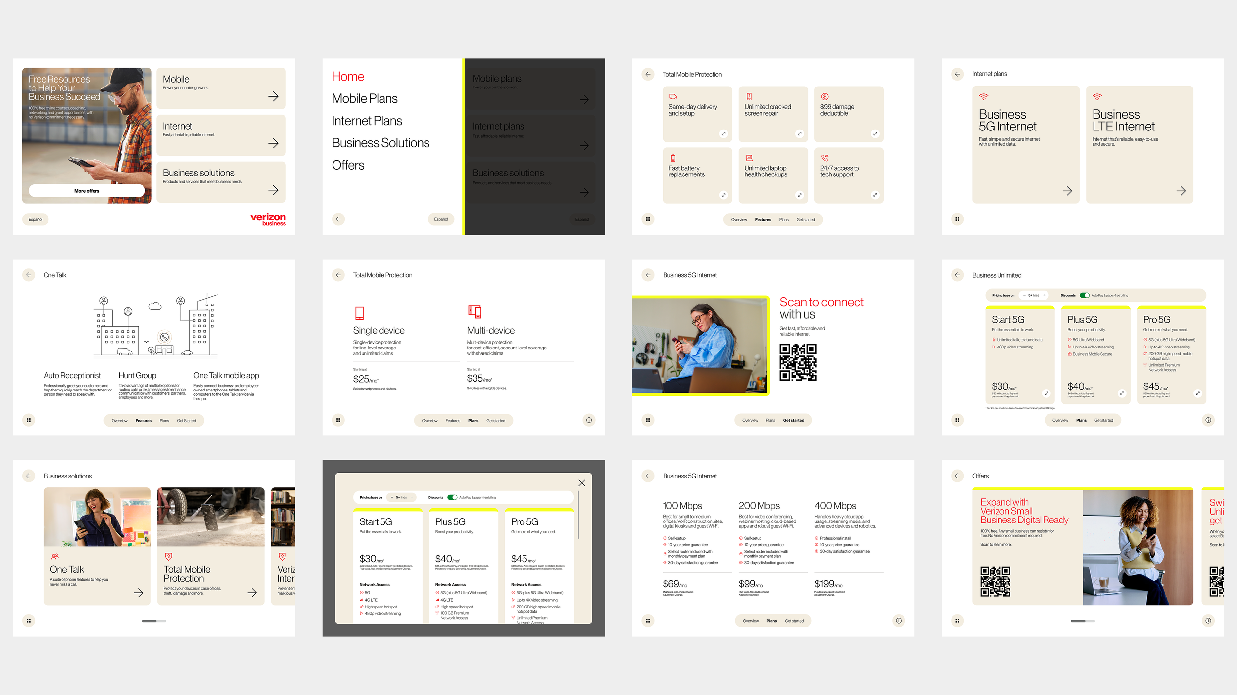
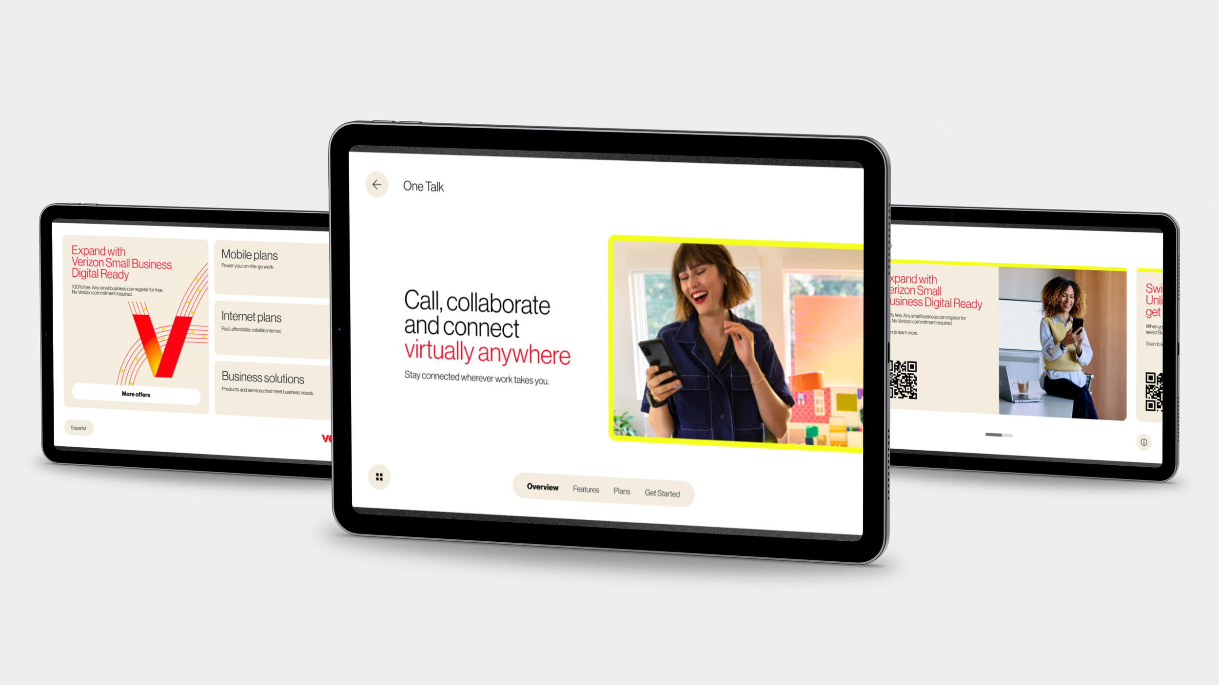
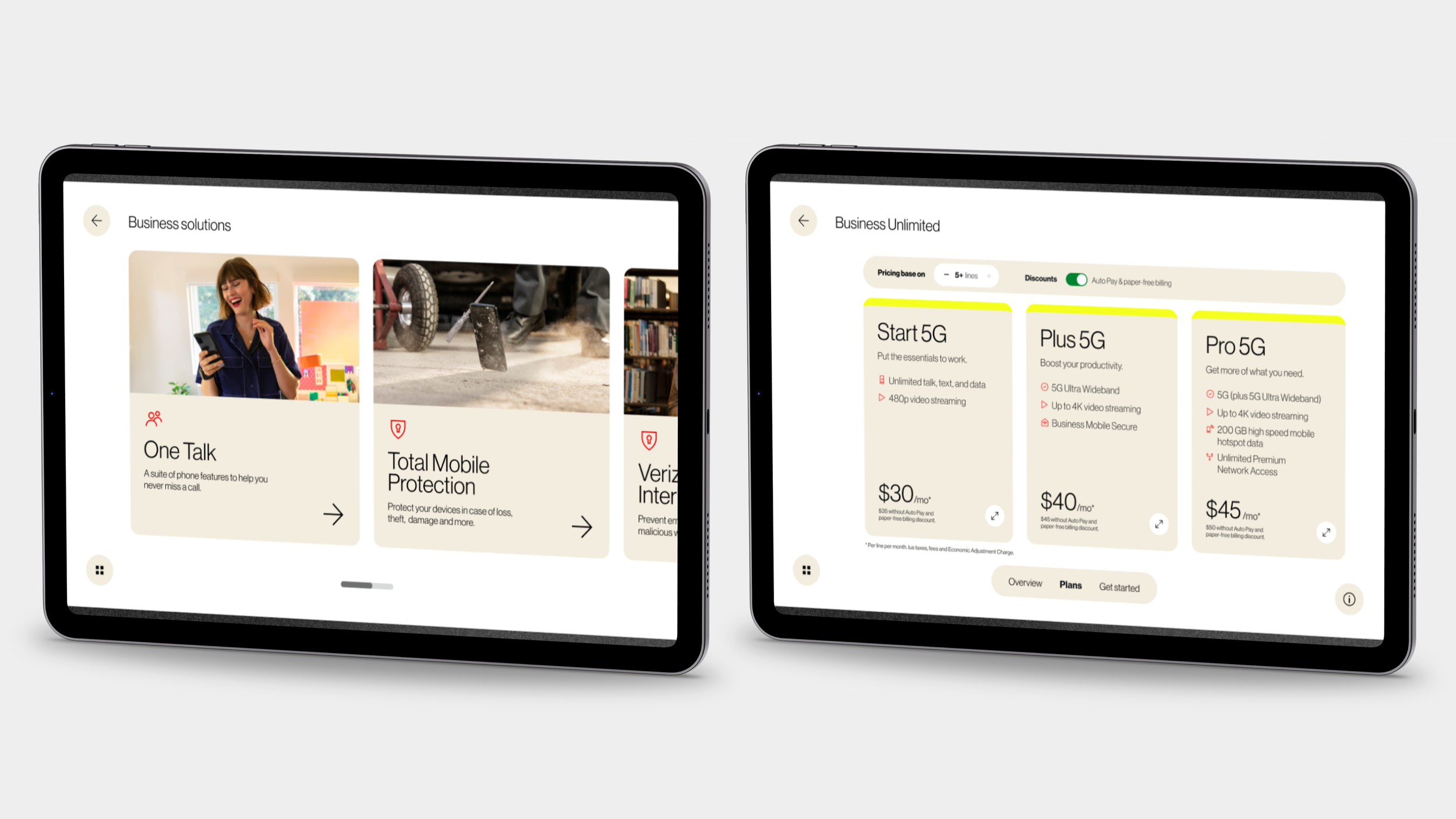
When Verizon launched its brand refresh, the retail system was the first place it landed. I designed the Small and Medium Business product experience for in-store tablets — the flow a customer walks through mobile plans, internet plans, and business solutions.
Decisions that came from the environment rather than the brand:
Navigation anchored to the bottom edge. On a tablet held at counter height, the top of the screen is the hardest place to reach and the easiest to smudge.
Bilingual parity. The Español control sits in the same position on every screen, because language switching happens mid-conversation, not at session start.
QR as the handoff. The tablet is shared hardware. Anything the customer keeps has to leave the device without an email capture step.
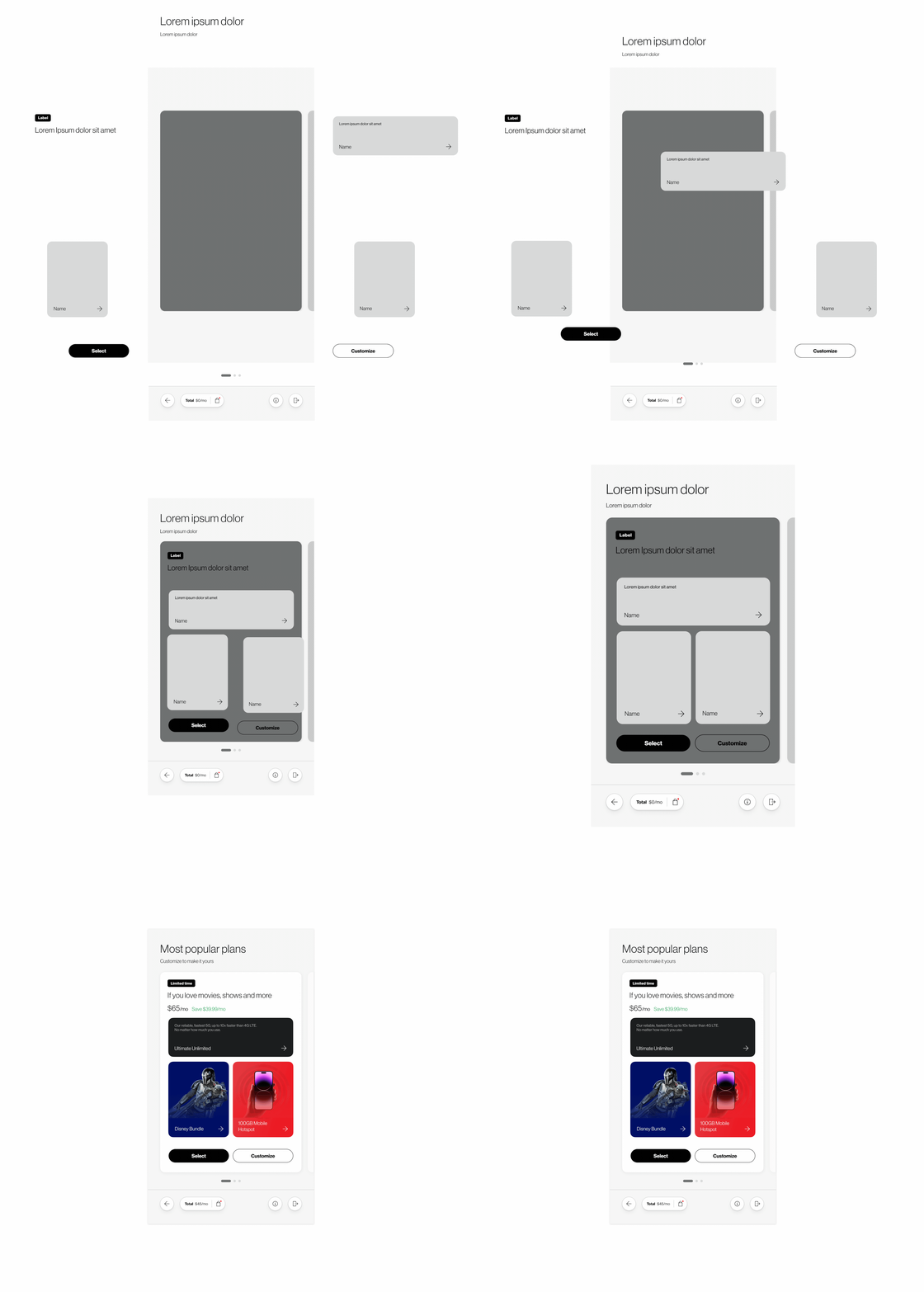
Pricing configurators as components. Line-count steppers, AutoPay toggles, and tiered plan cards encode Verizon's business rules as reusable components with defined states, so promotional changes update through the system rather than through redesign.
The brand refresh shipped across the SMB experience without rebuilding the component layer.
Where it landed
Six months from kickoff to MVP, with design complete and implementation on Brand Central following. Deployed across Verizon retail digital touchpoints nationwide, with guidelines and the Figma component library on a three-month update cadence.